Restaurant’s Profile Page Redesign:
Redundance Out, Relevance In
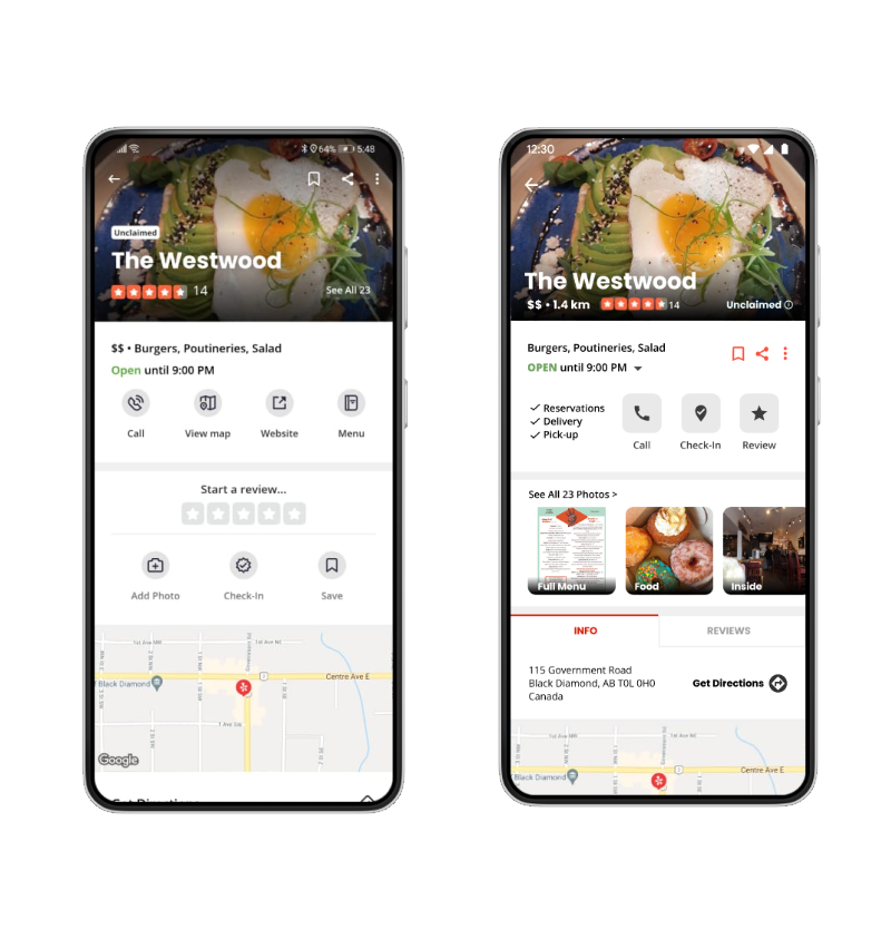
LEFT: Original design by Yelp. RIGHT: My redesign.
Based on my UX knowledge, I thought of many things that could be changed in the Yelp app for improving usability.
In this unsolicited redesign, I propose a new approach to the profile page of a restaurant.
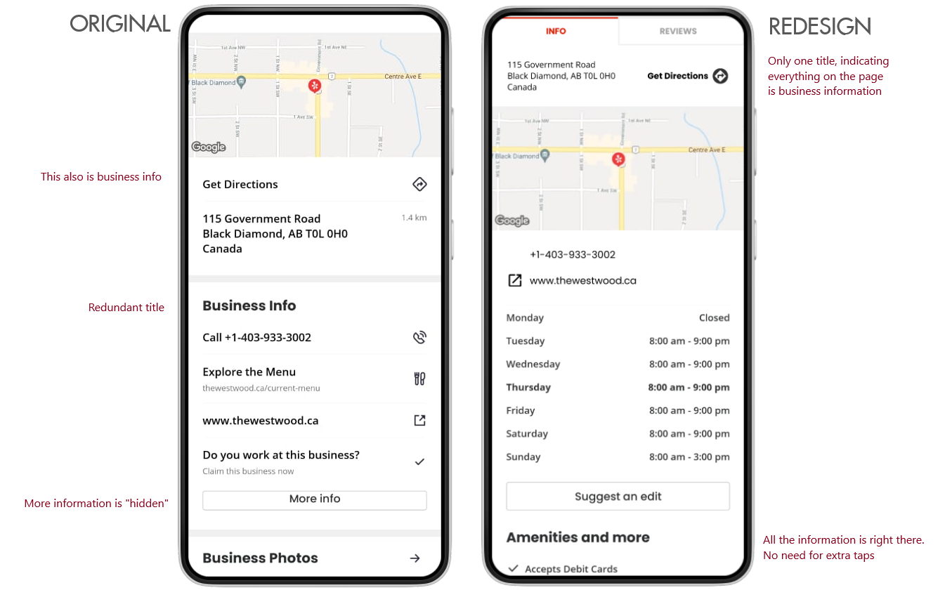
In the original design by Yelp, there is a long scroll with 10 sections that are redundant and mix types of information.
As a starting point for this comparison, I took a screenshot of the current version of the Yelp app and put it in a Figma prototype.
Please note that this exercise was just for the business information of a restaurant. The purpose was not to modify the app features, but only the display of the contents. In this sense, the prototype for the original design does not include clickable features, but only the main page showing the business’ information.
Yelp v22.7.0-26220717
Android 10
February 2020
Original Design by Yelp
The most relevant information is not easily visible at first.
There is a long (4440 px, in this example) scroll and still, some relevant details are not revealed until the user clicks on “More info”.
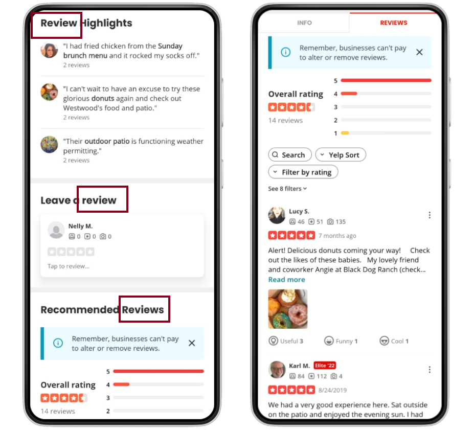
The information about the business is mixed with the contents related to reviews.
A little bit cluttered on top with a lot of space in the middle.
Only one (obstructed) photo.
Scrollable Figma Prototype:
My Proposed Redesign
The most relevant information is easily visible at first.
The scroll length was reduced to less than half (2150 px) and all relevant details are there. Removed the “More info” button.
Two categories of information are well defined in tabs: INFO | REVIEWS.
Better distribution of elements.
More (clickable) photos.
Interactive Figma Prototype:
In Detail
1- The main photograph is cluttered with many elements and it is darkened by the shadows used to give contrast to those elements.
2- I rearranged the icons to a more visible place and removed/reduced the shadows, allowing to show the real colors of the main photograph. I also added relevant information such as the distance and price range of the restaurant.
3- The "Unclaimed" tag doesn't say much.
4- The "Unclaimed" tag has an "info" icon, which shows it is clickable to explain the term or even claim the business.
5- The "Open" status phrase only displays the information of the moment.
6- The "OPEN" phrase not only shows the current status but also indicates (through a down-arrow) that it is clickable to see the full business hours.
7- The Save, Share, and Menu icons are more visible.
8- In the original design, if the user wants to make a reservation, order a delivery or pick up food, they would have to find the availability of the restaurant after clicking the "More info" button, which is not shown at first sight. In the redesign, the user can see immediately what kind of service does the restaurant offer.
9- The "View map" button is redundant because the map is already shown on the same page. The "Save" icon also appears twice.
10- I would rather not show the restaurant's website link immediately, as it would take the user out of the app. Instead, I would provide all the information within the app while keeping the link available within the business details.
11- Order of contents: The instructions to leave a review come BEFORE the location of the restaurant, but in the overall experience, the user would visit the business (using the address, location information, or the "Get Directions" option) before actually writing a review.
12- The main actions for Yelp are those which get the client to the business, as well as the genuine reviews from other customers. Those actions are more clear through fewer, bigger buttons: Call, Check-In, Review. I left out the "Add Photo" button because it would come after tapping "Review" or "Check-in".
13- To see the menu, the user has to click an icon.
14- The menu is showing in a thumbnail and is an album within the pictures gallery. This clickable image would take the user to the PDF of the full menu if the restaurant has it, or real pictures of the physical menu, just as in Google.
15- Instead of just a small text indicating more pictures, I put a gallery showing them in a horizontally-scrollable carousel.
Instead of having a very long scroll (4440 pixels in the original profile page for The Westwood), I divided the contents into 2 main sections: Info and Reviews.
This allowed to shorten the scroll to less than half of the original, but most importantly, it clearly sorted the information that was interleaved and redundant.
With these described changes, the usability of this digital product could be hugely improved.
You can see the final prototype in Figma. Please note that this exercise is meant to be only regarding the display of business information, not about the app’s features.
While the prototype is fully scrollable, only a few points are clickable/tappable: the down arrow for the business hours, and the INFO - REVIEWS tabs.
Let me know your thoughts!
hello@nellyux.com


